ShopDreamUp AI ArtDreamUp

Deviation Actions


Comments16
Join the community to add your comment. Already a deviant? Log In
You have requested that I critique this work , by placing it into the "critique me" folder at <img class="avatar" src="a.deviantart.net/avatars/f/o/f…" alt="
 " title="FotoManipulationz"/>
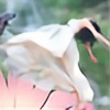
To start with , you've chosen your stocks well . The beautiful red hue of the girls dress perfectly matches that of the poppies.You have also done an excelent job blending the model into the grass, which must have taken alot of time and diligence . The war medal is a great addition as well because it speaks to why this lone girl is so sad.Your ideas for this image fantasticly emotional and tells a clear story.
There are several things in this deviation , however that need improvement.Starting with the lighting and shadows.The lighting on the scene is comming from high in the sky , at an Eleven o'clock position , but the shadows you've created are as if the sun were shining down from a two o`clock position.I would recommend moving the shadow to the oposite side of the girl. It should also be a very small and close shadow , as the sun is so high in the sky.The shadow from the medal should come down at an angle as it dangles off her dress, dissapearing where it is attatched . Instead It is placed simply beside the medal.I would also suggest a bit more guassian blur for such a shadow.
Next , I will mention contrast of you model to her surroundings.This beautiful and sad girl is very soft and luminescent , while the field is quite sharp. I would add some of that same luminance to the fiels for an all over soft feel.This might also help to address the "cut out" look at the top of your model, though I would also suggest a few micro hair strands.Tiny details like hair strands can be very effective at creating realism. You could use a tiny smudge tool , or use some of the many stock painted hairstrands here on DA.
Lastly , I would suggest strengthing the contrast on the texted poppys in the foreground.Make them a bit more seperated from your background scene. Try using an dark outer glow instead of the light to assist with that contrast. This can be achieved by setting the blend mode of the outer glow to "multiply" and choosing a darker color.(I'd suggest picking the darkest innermost red in those poppies.)